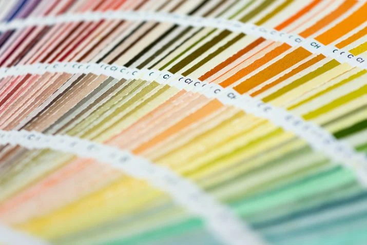
While classic hues remain timeless staples, each new year ushers in trends that speak to society's mindset and values. Following years spent craving comfort and nature's nurture, 2024's hottest shades channel our awareness of sustainability paired with the ongoing need for soothing spaces.
As some seek bold change and joyful tones, others continue prioritising spaces for retreat and wellbeing. Both will shape the hottest interior colour trends for 2024. To keep your property on trend and stylish, consider these colours for a revamp this year.
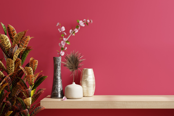
Magnetic magenta
One tone poised to make a dramatic comeback in 2024 interiors is deep, dark magenta. As experts note, the striking shade of mystical magenta encompasses pink's versatile appeal while transforming spaces in unexpected ways.
Defying expectations, this trending hue serves as more than an eye-catching aesthetic choice. When used strategically as a focal point, the rich, enveloping tones of magenta promote interaction and connection, and provide a moody, contemplative feel as well, containing occupants in a warm, intimate cocoon.
In 2024, expect to see magenta stealing the spotlight in bedroom spaces or home offices, encouraging relaxation and imagination. For those desiring a bolder magenta statement, use this deep pink shade as the dominant colour on walls, larger furniture pieces like sofas and armchairs or lighting fixtures, and contrast with neutral textures and lighter accent tones for décor that adds value.
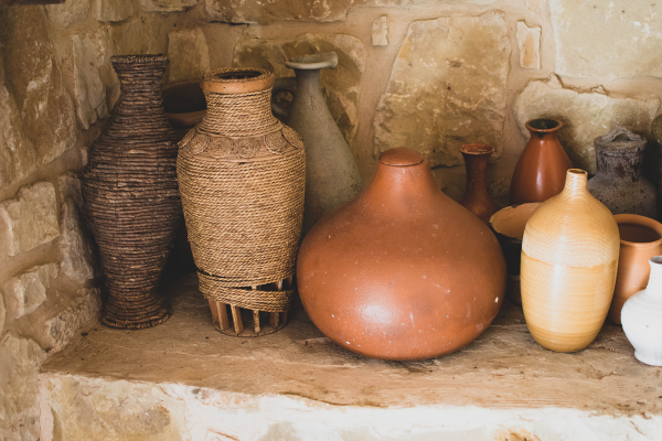
Clay neutrals
While vibrant colours may capture attention, clay-inspired neutrals offer a subtler, soothing trend for the new year. Timeless neutral shades provide a grounded warmth perfect for calming sanctuaries. Calming clay tones exude a cosy, earthy appeal that will strongly resonate with buyers and sellers alike in the coming year. As an alternative to stark white spaces, interweaving soft clay neutrals creates an intimately balanced atmosphere.
Pair natural tones with lighter trim and ceiling panels for a bright and fresh space that is calming and has universal appeal. Another way to incorporate more clay-like greys, browns and pink beiges is with plush carpets that add warmth and cosiness, as well as insulating properties for a more sustainable home, while also working well with a wide range of wall colours and patterns.
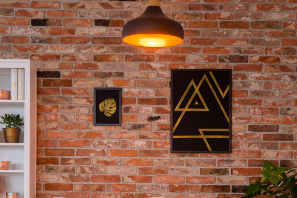
Rustic rust
For those tired of stark, minimalist décor, the upcoming year welcomes in the warm return of rustic rust tones. Adding longed-for warmth while turning heads with its bold, dynamic look, rust strikes the perfect balance this year. With an inherent cosiness that feels nostalgic while also invigoratingly fresh, expect to see rust shades energising living rooms, home offices and other spaces more and more.
Rust and copper metallic tones feel particularly of-the-moment when used strategically as an accent. The rich, glimmering shades pair perfectly with natural light, casting an overall shimmer that brings spaces to life. Using a textured metallic wallpaper in burnt sienna or terra cotta immediately draws the eye while providing an intriguing interplay of light.
When combined with additional rust or orange accents and layered with neutral tones, the boldness of rust injects vitality into once-stale colour schemes. For homes seeking a jolt of texture, light and cosiness in harmonic balance, rust is the trend delivering refreshing sophistication.
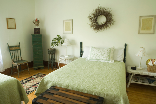
Pistachio perfection
One green tone transitioning from a bold forest hue to a softer, retro-inspired shade is pistachio. With vintage connotations that strip away any harshness, pistachio brings happiness and serenity to your interiors and is the perfect way to freshen up a bathroom or office.
Pistachio works beautifully in bedroom spaces, promoting a gentle, restorative sleep environment, and it’s a wonderful choice when paired with classic hues like pink or neutral woods, channelling vintage visuals perfect for relaxed sanctuaries. This tranquil backdrop shade comes alive on walls and in expansive spaces like dining rooms.
In the coming year, expect to see this creamy, retro-infused green upgrade drab rooms with its delicate dynamism, adding a calm vintage essence that works beautifully in period homes and more traditional properties.
Jewel-toned jade
Look for precious jewel tones like lustrous jade green to make a glimmering statement in 2024 interiors. Touches of this luminous gem hue add a sense of natural tranquility and exotic sophistication to bedrooms, living spaces and more. Designers note jade pairs harmoniously with creams, pinks, peaches, and even bold glossy red when used sparingly. From Mackintosh to Frank Lloyd Wright, jade tones have brought an exotic and regal touch to decor over the decades.
In next year’s homes, expect a return to the gentle luxury of jade hues, whether it's fully with jade walls, deep green bedding and rugs, or living room soft furnishings for a cohesive palette that feels luxe and stylish. Adding just a touch keeps the tranquility more neutral. But for those desiring full immersion in jewel-box elegance, monotone jade creates a glamorous feel, perfect for modern sanctuaries.
Rich chocolate browns
Embrace what is being pitched as the colour of 2024 with deep chocolate brown hues add a sophisticated yet cosy allure when incorporated thoughtfully into interiors, from blinds and curtains to tiles and carpets. Varying from warm espresso to smoky bitter chocolate, swathing your home in saturated shades of brown creates a grounding interior palette.
Darker earthen brown palettes may seem intimidating and overwhelming, particularly for smaller homes, but they deliver a quietly confident look when judiciously combined with lighter counterpoints like eggshell walls and driftwood floors. The depth of colour brings thoughtful focus while the nuanced tone remains versatile enough for diverse decors.
Let rich mocha chocolate browns upgrade your interior from mundane to indulgently chic, and in smaller spaces, embrace the cocooning effect for a decadent colour scheme. This dramatic yet neutral shade effortlessly sets an ambience of comfort and quality for living rooms, dining rooms and even hallways.
Whichever shades speak most at this cultural moment, these trends previewed steer interiors toward sanctuary, joy or both in 2024’s aesthetic. Whether through energising jewel-like accents or via a monotone cocoon of glistening green, colour is the perfect way to add a refreshing touch to any home.
This article was written by guest blogger, Annie Button.